Colour Trends for Spring/Summer 2019
Each season the Pantone Colour Institute creates their report on Fashion Colour Trends. It’s basically a synopsis that highlights the top colours used by Fashion Designers in their collections at New York Fashion Week. These very colours are a prediction of what will be seen throughout all walks of style from fashion to homewares.
Having recently been invited by JD Williams to inject a little Spring/Summer into my own wardrobe. I got thinking about the inspiration behind the top colours we’ll be seeing this Spring/Summer. And the inspiration that rang through for me was: nature. After all, art imitates life, and visa versa.
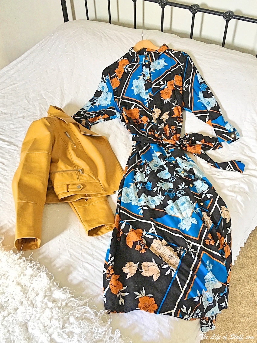
Pictured from JD Williams – Scarf Print Long Line Shirt Dress & Oasis Curve Faux Leather Biker Jacket.
My colour inspiration when choosing this outfit came from Pantone’s colour trend report: Living Coral, Princess Blue, Aspen Gold, Tumeric and Mango Mojito all feature within the outfit – why choose one colour!
Colour Trends Inspired by Nature
Living Coral
This year’s Pantone Colour of the Year is Living Coral. A colour the institute describes as “an animated, life-affirming shade of orange, with golden undertones”. But it really comes alive when next to blue, just like in depths of the sea.
And speaking of blue there’s …
Princess Blue
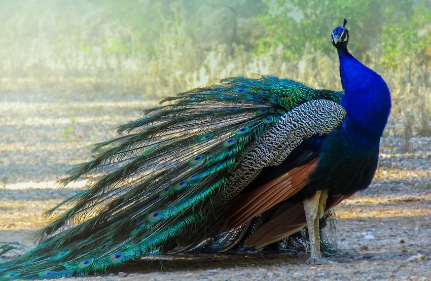
Pantone describes Princess Blue as “a majestic royal blue hue” that glistens and gleams. When it comes to majestic, there isn’t a more royal sight than an Indian Blue Peafowl. The richness in colour of its chest is fit for a princess, or a prince!
And when you talk about richness, there’s always gold …
Aspen Gold
Pantone’s Aspen Gold promises to brighten your day. Pantone even suggests it “stimulates feelings of joy and good cheer”. And you’d have to agree when you take a look at where in nature it can be seen – most notably in the golden leaves of the aspen tree.
But if gold isn’t your thing you could always go a little spicy! How about …
Tumeric
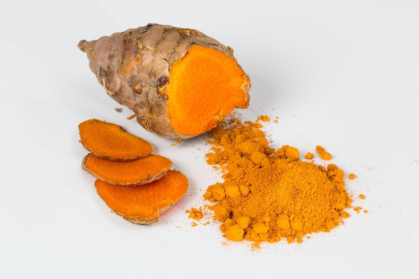
Pantone describe Tumeric as ‘an enlivening orange that infuses a hint of pungency into the palette’. It certainly does add a bite, and some depth.
But if you’re looking for something less acrid try the sweetness of …
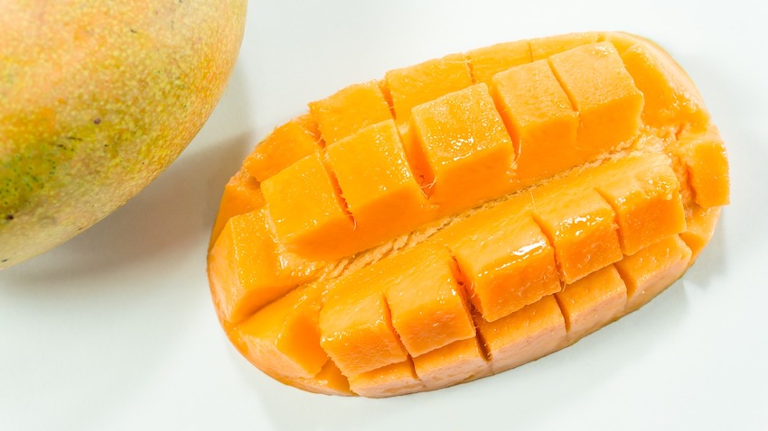
Mango Mojito
Pantone ensures us that our sweet tooth will be satisfied as the golden yellow of Mango Mojito ‘feeds our craving for pleasant comforts’. It’s certainly sunny, uplifting, a bit like a proper mojito!
For more on Pantone’s Spring/Summer trend report visit pantone.com
For JD Williams’ latest campaign follow:
https://www.instagram.com/p/BvBuQuCAzDa/
*****
You can find The Life of Stuff on Facebook, Twitter and Instagram but don’t forget ↓
- Best Cocktails to Have While Travelling Europe - October 9, 2024
- 4 Reasons Malta Should be on Your Holiday Shortlist - September 16, 2024
- Travel UK: 8 Must-See Attractions for Your Cornwall Trip - September 6, 2024
